|
Re: Packard Seniors 1940-56
|
||||
|---|---|---|---|---|
|
Home away from home

|
Tim - the Crestline book on Cadillac really laid into the 1950-53 styling, basically said the same thing you did. I agree, never liked the bloated look. The '54s were improved but am not a fan of the long deck, cab-forward look.
"Packard at a loss..." Had Packard's marketing folks been given cars with the proportions shown in the ads below, the cars would have flown off the lots. Look at the distance between front axle and front door leading edge in these ads. Much longer than actual Patrician. This is why I keep suggesting Packard needed 5 more inches up front and in back of the Patrician. It wasn't rocket science, the folks making these renderings knew exactly how the cars should have looked. And yes, the grill needed to be better. Call it snobby, snooty, high brow or proud, the Packards of yore had the stuff a certain sizable percentage of the moneyed crowd wanted. In the Fifties there were probably lots of older folks especially who would have chosen Packard over Cadillac had the cars had the right look up front and from the side, back and driver's seat. I think people did secretly want a Packard but Packard didn't give it to them. That last '55 ad in particular really captivates me. It has the styling elements of the actual Patrician but is a different car. It's fabulous!!! And the color is right for the car, very Packard and very not Cadillac. Attach file:  (55.74 KB) (55.74 KB)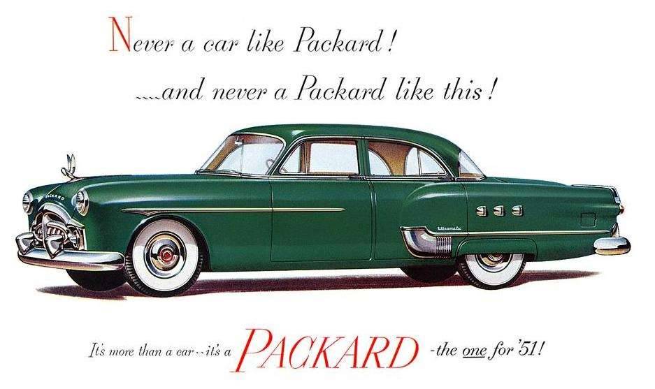 (66.61 KB) (66.61 KB)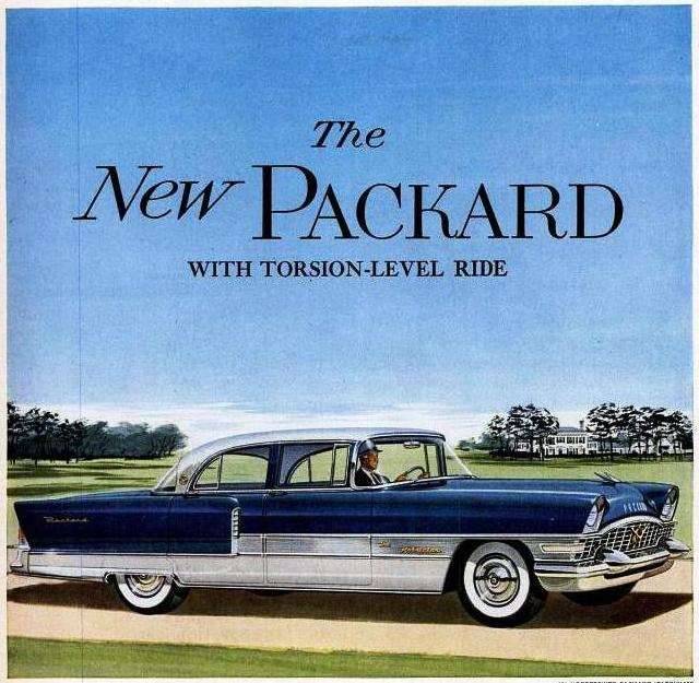 (56.06 KB) (56.06 KB)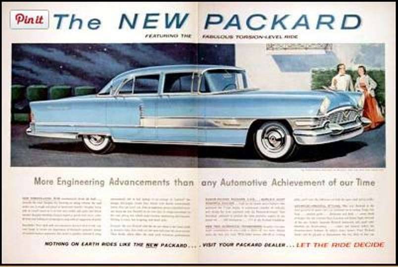
Posted on: 2015/5/10 19:39
|
|||
|
||||
|
Re: Packard Seniors 1940-56
|
||||
|---|---|---|---|---|
|
Home away from home
|
Here's a 132 wb car that nudges closer to that last ad's ideal by dropping the beltline/raising the glass 3/4 of an inch. Gives the car a wider, sleeker stance. Better proportions were within Packard's reach all through these years.
Many thanks to owner of the beautiful '55 Four Hundred. Attach file: (77.57 KB)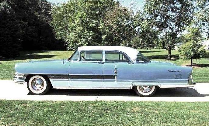
Posted on: 2015/5/12 16:16
|
|||
|
||||


