|
Re: 1955-57 What-If Line-Up
|
||||
|---|---|---|---|---|
|
Home away from home

|
Thanks, much appreciated.
Posted on: 2010/12/1 13:17
|
|||
|
||||
|
Re: 1955-57 What-If Line-Up
|
||||
|---|---|---|---|---|
|
Home away from home

|
Great observations and I largely agree. There have been so many fantastic thoughts expressed in these forums through the years; properly organized and edited they would make a great book.
The drop away rear seemed to work best with 1930's cars that have extra long hoods, pontoon fenders and pinched in sides. Speaking of the '48s, someone in a long ago Packard forum once made a very astute comment about how they looked best in convertible form because the highly curved-in beltline was not as visually apparent as on the sedan and coupe, and this was perhaps one element that accounted for the convertible's winning so many awards when first introduced while the sedans won none. The short drop-away rear also seemed to work best on this car because it gave it a racier image. I like your thoughts on the need for better differentiation. We discussed this in regards to the Clipper in a recent forum: packardinfo.com/xoops/html/modules/newbb ... 62807&topic_id=5918&#forumpost62807 The one concern I would have with the common wheelbase post-Clipper is that on the longer wheelbase Packard seniors, the coupe and convertible might stretch too long. As a general rule, for a given platform I think 2 door models look best on the shortest wheelbase and 4 doors on the longest. You mentioned Cadillac and I think it is instructive to understand their marketing approach, particularly beginning with the 1951s where they created a very complicated sharing strategy for their Series 61 sedan, 62 coupe and sedan, 60 Special sedan and 75 limo: 4 wheelbases - (61 - 122) (62 - 126) (60S - 130) (75 - 146-3/4) 4 greenhouses - (61 sedan) (61 coupe, 62 coupe) (62 sedan, 60S sedan) (75 limo) 2 rear decklids/fenders/overhangs - (61 sedan & coupe, 62 sedan, 75 limo) (62 coupe, 60S sedan) Confusing? Add in the commonality with Olds and Buick and things really get interesting. Cadillac's numerous dimensional variations are clearly what prompted Nance to do the 1955 Four Hundred and Caribbean body that put the Clipper's coupe greenhouse on the longer 127 inch wheelbase and created the appearance of a longer decklid. I would not be surprised if Nance had also pined for a 132 inch flagship sedan for 1955 with the Patrician's greenhouse and similar long decklid appearance to take on Cadillac's 60 Special, which was selling in phenomenal numbers given its high price. But Cadillac's sheetmetal micky-mousing notwithstanding, I would argue that Packard should have avoided such an expensive (for a small company) strategy. Put the coupe on the shorter wheelbase, sedan on the longer, add a flagship series on an even longer wheelbase that required lots of manual body shop work but low investment, tighten up the pricing spread between the high and low models and push average transaction prices and margins much higher. To be successful it would have required best-in-class performance, styling and quality. And a little luck.
Posted on: 2010/12/1 21:33
|
|||
|
||||
|
Re: 1955-57 What-If Line-Up
|
||||
|---|---|---|---|---|
|
Home away from home

|
Well, I guess that did bear repeating.
 On another note, I'm quite amazed that you mentioned the '51 Frazer, with which I also have a little personal experience (dad seemed to like to go against the flow with car choices). I had many adventures as a passenger in a '51 Vagabond, which I thought, along with other short-lived Frazer models, was one of the nicest renditions of the early '50s look (dad also seemed to have some taste in styling). Anyway, I'd be most interested in a styling take on a '55-'56 body based Packard, with front clip sheet metal work that accommodates quad headlights. I was literally losing sleep last night thinking of how to achieve this ultimate late-'50s styling requirement without having to come up with a completely different body. I don't do renderings, but I did get a few ideas on how to achieve this with a different front clip, including hood, and a re-worked deck lid. It still includes the "hooded" headlight look in front (without the '56 peak), a reworked grille with classic Packard upright bars (like the '55 Clipper knocked off the old style). You could still achieve the "wide" look with the vertical bars if they were set at a rake angle from the top chrome piece back, and the entire grille shortened a couple of inches to a give it a prominent thrust. Also, imagine subtle differences in paint shading instead of those rather undignified two and 3 tone sides. Lose the Reynolds wrap and keep the dual chrome strips, with a tastefully contrasting color between them, and a matching colored roofline. The deck lid would be a different stamping, squared off in the rear, following a curved horizontal across the back that flattens at each end (reprising the elongated Packard style grille on the front. Keep the cathedral tail lights, but surround them with a tasteful 1/2" chrome strip around the outer edge (visible from the side) and shape the chrome to give a peaked hood ending in a point over the light. This would give the illusion of a longer rear fender with a more sleek look. The bumpers could both be re-worked, de-emphasizing the dagmars in the front by using a smaller, oval shape terminating in a flattened black rubber bumperette. The rear bumper would need to be more squared-off to match the look of the trunk, and the exhaust ports would look very nice if they were louvred and rectangular rather than the round, open look. I hope the description makes some sense. I can visualize it, but I don't know if a description really conveys the ideas... and I can't render anything for spit.
Posted on: 2010/12/1 22:21
|
|||
|
Guy
Not an Expert |
||||
|
||||
|
Re: 1955-57 What-If Line-Up
|
||||
|---|---|---|---|---|
|
Home away from home

|
Oops, not sure how that post got repeated... but it done ain't repeat'n anymore.
Your father had great taste! I saw a '51 Frazer at the Hudson museum in Ypsilanti, right here in the Detroit area. What a nice car, very good proportions and detailing. What did you think of the Vagabond's trick hatch? I created something similar recently on a Caddy SRX, you can see pics at mahoningdesign.com and get the background story at: thetruthaboutcars.com/interview-paul-wes ... the-search-for-a-cadillac-flagship/ But back to your design vision. Sounds very interesting and promising. The thread that I mentioned in previous post has some what-if Request images at the end but they are not what you are suggesting. Here's a start at the front. Did you mean the tinfoil around the headlights or along the car's sides? Do you want the front bumper low like I show or higher like the Request? What do you envision in the area under the headlights/above the bumper? Did you want a split front bumper with the grill continuing down like the Request? Anything else up front? Paul Attach file:  (20.62 KB) (20.62 KB)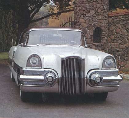  (28.91 KB) (28.91 KB)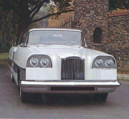
Posted on: 2010/12/2 9:25
|
|||
|
||||
|
Re: 1955-57 What-If Line-Up
|
||||
|---|---|---|---|---|
|
Home away from home

|
Quote:
Paul[/quote] Thanks, my dad would appreciate that. The Vagabond hatch was very trick and easy to use. With the back seat folded down, the cargo area was enormous. My dad used it for a hunting car a number of times, and even with three other guys, (and 4 deer) they did NOT have to put any of them on the fender (the deer, not the guys... I don't think-- but wait, to get the deer in, they must have had to fold the seat down, thus it was either 4 guys across the front seat, or three and one on the fender... hmm.) Quote: Anything else up front? Whoa, Paul, you're going in the direction I envisioned with the treatment of the quad headlights. I would go with the full-width grill, with direction signal lights at the corners, and vertical bars across the full width--just play with a '55 Clipper grille. The thing about the upright centered grille is it has a tendency to make the front look narrower, when wide is the look that was popular. The quad headlights alone help give the impression of a wider front. Adding the full width grille accentuates it even more. (I know, horizontal bars would add even more to the illusion, but I favor the vertical bars as faithful to the classic Packard radiator.) It's commonly believed that the full width grilles starting with the Reinhardt bodies completely abandoned the "classic" Packard grille, but look closely and the shape is still there... it just is extended across the width of the car, with the horizontal ends cleverly tucked under the headlights, and the arch in the middle very evident. Even though the '48-'49-'50 cars held onto the "radiator" effect, they abandoned the vertical bars for the 'egg crate' look, which was resurrected for the '55 and '56 Seniors, and I don't believe had any other significant Packard history. It's very interesting to see how styling cues are integrated from much earlier models into later ones, in many makes of cars. My '65 Electra even had "running boards." You just had to look close. The "Reynolds Wrap" typically refers to the wide chrome pieces running down each side of the '55 and '56 Seniors, (also with obvious "running board" styling--ridges with bright highlights on a black background). In my opinion, while they are striking and a bit daring, they do not "slim" the beltline as much as a contrasting paint stripe, which was used in lieu of the chrome on some trim levels. My only beef with the paint stripes is that they usually were in stark, contrasting colors. I would have gone for a more subtle look-- like for instance a black strip on a dark gray car, or a deep red on a burgundy car. Usually, the stripe would be a slightly lighter shade than the rest of the body, and the roof would match the stripe. Running yet another color under the painted stripe, as was done on some Caribbeans for a 'three-tone' paint job, looked much too busy for a dignified Packard, IMO. BTW, check outkfnut.com/ for more than you'd ever want to know about Kaiser-Frazer and Henry J cars.
Posted on: 2010/12/2 21:43
|
|||
|
Guy
Not an Expert |
||||
|
||||
|
Re: 1955-57 What-If Line-Up
|
||||
|---|---|---|---|---|
|
Home away from home
|
Just a quick point relating to an earlier part of the thread..
credit given to Raymond Lowey for the 53 Starlight coupes is largely mis-placed. I have a friend here in NY whose father worked for Lowey in NYC in the 30-50s. Credit is generally given to Bob Bourke for the Starlight and Exner for the earlier bullet nose models. Lowey was rather prone to taking credit for designs dome by other's who worked for him.
Posted on: 2010/12/3 15:48
|
|||
|
56 Clipper Deluxe survivor
|
||||
|
||||
|
Re: 1955-57 What-If Line-Up
|
||||
|---|---|---|---|---|
|
Home away from home

|
Quote:
Good point, the "worker bees" often don't get the credit they deserve. I believe Loewy was also credited for the design of the '63 Avanti as well as the Coke bottle, streamline locomotives, early Boeing airliners etc.
Posted on: 2010/12/3 16:40
|
|||
|
||||
|
Re: 1955-57 What-If Line-Up
|
||||
|---|---|---|---|---|
|
Home away from home

|
That's one of the reasons I was content to leave Ford... got tired of being one of thousands of pack mules laboring to get a Director up the hill to VP-land.
55PGuy - great observations on Packard's ability to keep the grill theme going. Also really like your comments on the more subtle contrasting colors, they seem more befitting a Packard. Continental Mk II would have looked questionable with extreme three tones as well. Here's another attempt. Included original so you can toggle between the two to see the changes. Feel free to put a big red X on it if not what you were thinking. Attach file:  (16.04 KB) (16.04 KB)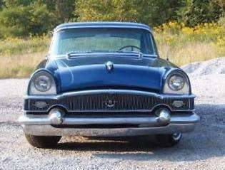  (16.50 KB) (16.50 KB)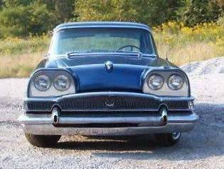
Posted on: 2010/12/3 19:03
|
|||
|
||||
|
Re: 1955-57 What-If Line-Up
|
||||
|---|---|---|---|---|
|
Home away from home

|
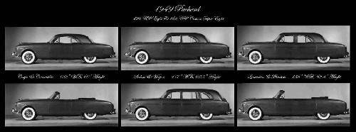
Something about the holidays makes me want to photoshop. Here's a what-if 1949 line-up based on the image and rationale I laid out earlier. The strategy would have included a significant Darrin influence, particularly his late 30s/early 40s Victoria and Ed Macauley's one-off '41 sedanca coupe. As such, the '49 coupe and convertible would have lowered bodies, lengthened hoods, more steeply raked windshields and backlights and for the coupe, a thick c-pillar. Since Packard went with a pillarless convertible, chose that scheme for both the convertible and coupe. Would have held up well, I think, against Caddy's Coupe DeVille. Henney would have made the long-wheelbase models.
The difference between this strategy and the 48's that Christopher actually approved is an emphasis on modern lines, glamorous styling and the upper end of the market.
Posted on: 2010/12/5 15:56
|
|||
|
||||


