|
Re: 1955-57 What-If Line-Up
|
||||
|---|---|---|---|---|
|
Home away from home

|
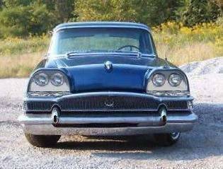
BH is right about the size of the lights, but I really like the look of the Clipper grille shortened like it is, above that slick bumper. With the correct proportions for the headlights, there would be space below them for the wraparound direction signals (positioned above the grille).
The earlier photoshopped "Request" with the oversized headlights looks very, very like the Rolls Royce style that Rolls used in so many later models. The Packard/Rolls connection goes back to the WWII Merlin V12--Packard has a history of taking a Rolls Royce design and making it work better! Good show!
Posted on: 2010/12/5 17:45
|
|||
|
Guy
Not an Expert |
||||
|
||||
|
Re: 1955-57 What-If Line-Up
|
||||
|---|---|---|---|---|
|
Home away from home

|
Quote:
I agree about Loewy's self aggrandizement and lack of design talent. If anyone wishes to dispute this, please look up the cars we know beyond doubt were Loewy's own inspiration. I refer to his personal cars which were stock Detroit models customized and built exactly to suit his taste. Here is one, a 1959 Cadillac modified to Loewy's designs in Paris. remarkablecars.com/for-sale/custom-cars/ ... -de-ville-raymond-loewy-custom.html Another shot of the Loewy Cadillac if you can stand it flickr.com/photos/oybay/4286439484/ There are others as bad or worse. The Studebaker "Loewy coupe" he customized with added trinkets and knick knacks is a real stinker.
Posted on: 2010/12/5 18:20
|
|||
|
||||
|
Re: 1955-57 What-If Line-Up
|
||||
|---|---|---|---|---|
|
Just can't stay away
|
he Lowey Caddy is (IMHO) hideous....Even Virgil Exner (Chrysler Corporation) wasn't that bad.....
Posted on: 2010/12/6 1:51
|
|||
|
||||
|
Re: 1955-57 What-If Line-Up
|
||||
|---|---|---|---|---|
|
Home away from home

|
Good catch on the headlights, thanks. Here's a few more tries. Am floundering a bit.
The front of Lowey's Caddy looks odd. So does the production version, imho. The rest of his design seems OK, second generation Corvair coupe looks suspiciously similar. Updated the '49 line-up posted a few threads earlier to correct a mistake. Also included a wagon version in a separate line-up. Not sure if they were popular in the late 40s but Packard might have needed a 7 pass car of some sort for wealthy Catholic families. :) Attach file:  (16.58 KB) (16.58 KB)  (16.47 KB) (16.47 KB)
Posted on: 2010/12/6 17:55
|
|||
|
||||
|
Re: 1955-57 What-If Line-Up
|
||||
|---|---|---|---|---|
|
Home away from home

|
If your work so far is "floundering" you do it very well!
The front is so tall, it looks kinda funny with the smaller lights, doesn't it? Add the slimmer grille to that and there seems to be a lot of extra space. I think some imaginative horizontal lines would help. How about amber direction signal lamps, a bit thicker (to take up space) and some black eye shadow under the headlights... maybe just a horizontal bar a couple inches thick, or maybe a more elaborate surround (like the '56's). Here's something scary, a surround of black with a chrome "lazy 8" around the headlights themselves... half an inch or so. Kind of like the old stereotype "binocular" effect used so shamelessly by hollywood to indicate that you're seeing someone's view through field glasses! This would require lowering the headlights just a tad, which might be a good thing. But first, just add the amber to the direction signals, I think that would make a big difference all by itself. The grill could by a little taller, but it's awfully nice the way it is. Thank you for your patience in this process. I hope you're enjoying it as much as I am. It's easy to tell that you are used to creative give-and-take. I am a former frustrated "creative director" The "real" creative director where I worked also owned the agency, and could be very uncreative and bull headed (to put it nicely). I used to get opportunities to work with the layout and design folks when he went on vacation, and it was amazing how much good stuff we got done--and how quickly--when old blood and guts wasn't around. This is a similar feeling, although I used to be looking at the computer screen over the designer's shoulder, and art directing on-the-fly. It was fun when we got in sync!
Posted on: 2010/12/6 22:05
|
|||
|
Guy
Not an Expert |
||||
|
||||
|
Re: 1955-57 What-If Line-Up
|
||||
|---|---|---|---|---|
|
Forum Ambassador
|
In addition to 55Packardguy's comments, mine are similar -- but it's interesting treatment and surely plausible. I think it still looks a bit much around the lights though. It might look a little more subtle with the metal light trim toned down a bit. Maybe body color with just a slight surround--but you're the artist and most all of your efforts are still commendable.
Posted on: 2010/12/6 22:17
|
|||
|
Howard
|
||||
|
||||
|
Re: 1955-57 What-If Line-Up
|
||||
|---|---|---|---|---|
|
Home away from home
|
I always wished Packard had done quad headlights... so maybe
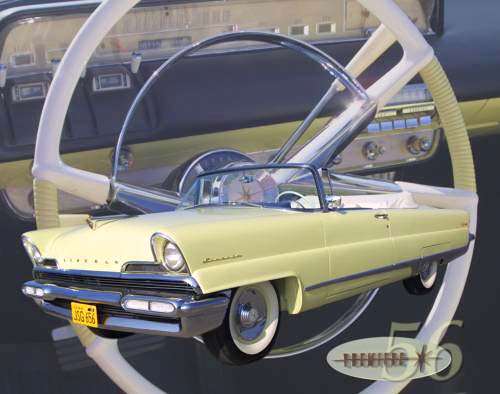
it would look less heavy if you enclosed them the way Exner did: see the headlights of the 57/8 NYer, 300, etc., and had body colored panel between them and the grill. The 57 NYer grill was particularly powerful and elegant looking, imo. Exner's Forward Look was the one that set the pace in 57. The 56 Lincoln Premiere took the Sr. Packard tailight design theme to new heights with a slimmer and more sleek variation. Someone even once commented that the 56 Premiere was a more modern Packard without all the bugs. It was even considered briefly for body sharing with Packard for 57 but Ford shot it down.
Posted on: 2010/12/7 11:24
|
|||
|
56 Clipper Deluxe survivor
|
||||
|
||||
|
Re: 1955-57 What-If Line-Up
|
||||
|---|---|---|---|---|
|
Home away from home

|
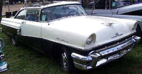
That would be this one. Mercury, of course also used a body style similar to this, as mentioned earlier.
HOWEVER, the idea here is to use a similar, "hooded" headlight arrangement, which first appeared in '55 Packard and Clipper exclusively, and go a step beyond the Lincoln/Mercury/Plymouth copycats and tastefully work in quad headlights for an all-new Packard look... with due respect to Mr. Exner, we want to beat him.
Posted on: 2010/12/9 21:49
|
|||
|
Guy
Not an Expert |
||||
|
||||
|
Re: 1955-57 What-If Line-Up
|
||||
|---|---|---|---|---|
|
Home away from home

|
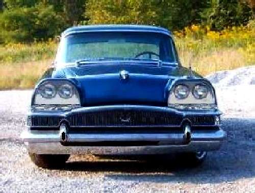
I wanted to see how Mahoning63's latest looked in a larger format. I tweeked it a little for contrast. (This is the first of the two versions shown above.) Compare it with my family's blue Clipper in the corner of my posts. I do believe I like the re-design better.
This tweak of the front end would be well within the capabilities of a good Rod and Kustom guy. Something to think about when confronted with a couple of "Parts Cars" and lots of cash.
Posted on: 2010/12/9 22:16
|
|||
|
Guy
Not an Expert |
||||
|
||||


