|
Re: Font/typeface of One Twenty, One Sixty, and One Eighty nameplates
|
||||
|---|---|---|---|---|
|
Forum Ambassador
|
G'day Kevin-G,
 to PackardInfo. to PackardInfo.Probably doesn't refer to the style you're researching but did you see the reference to custom typefaces by Owen_Dyneto in Post #4 in this thread?
Posted on: 2014/2/17 17:04
|
|||
|
Mal
/o[]o\ ====  Bowral, Southern Highlands of NSW, Australia "Out of chaos comes order" - Nietzsche. 1938 Eight Touring Sedan - SOLD 1941 One-Twenty Club Coupe - SOLD 1948 Super Eight Limo, chassis RHD - SOLD 1950 Eight Touring Sedan - SOLD What's this?  Put your Packard in the Packard Vehicle Registry! Here's how! Any questions - PM or email me at ozstatman@gmail.com |
||||
|
||||
|
Re: Font/typeface of One Twenty, One Sixty, and One Eighty nameplates
|
||||
|---|---|---|---|---|
|
Home away from home

|
I'd vote for hand lettering. That way the look would be exclusive to the company.
You are aware that there are several Packard and Clipper fonts available on free sites......
Posted on: 2014/2/17 21:28
|
|||
|
When two men ride the same horse, one has to be in the back...
|
||||
|
||||
|
Re: Font/typeface of One Twenty, One Sixty, and One Eighty nameplates
|
||||
|---|---|---|---|---|
|
Forum Ambassador

|
A bit of a long shot but if you check the Design Patents listed on the patent plate you just might find that one of them covers the script. Look for 6-digit patent numbers with the prefix "DE" or "DES" and then look them up at the Patent Office.
Posted on: 2014/2/17 23:45
|
|||
|
||||
|
Re: Font/typeface of One Twenty, One Sixty, and One Eighty nameplates
|
||||
|---|---|---|---|---|
|
Just popping in

|
I'd like to thank you all for responding. No sign of this font anywhere else other than the nameplates, at least so far. I am aware of the 'Packard' font that was issued in 1913; this isn't the same one, unfortunately...and the design patent angle is great; will be pursuing this!
Thanks again. Kevin
Posted on: 2014/2/25 17:11
|
|||
|
||||
|
Re: Font/typeface of One Twenty, One Sixty, and One Eighty nameplates
|
||||
|---|---|---|---|---|
|
Home away from home

|
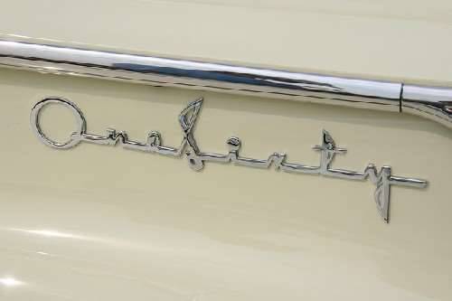
I do a lot of graphics work and am familiar with a lot of fonts. This one is definitely a script type. The "O" and "S" are obviously exaggerated (i.e. extended vertically) and the lettering is stretched. My initial though was that it might be Magneto, but when I put that to the test, it is clearly not. I'd suggest you go online and look up popular fonts from the 1930s and 1940s. I think that it is an actual script font as opposed to one created by Packard. I really like the font and design -- it is a classical Art Decco style.
Posted on: 2014/2/26 7:25
|
|||
|
You can make a lot of really neat things from the parts left over after you rebuild your engine ...
|
||||
|
||||

 (15.62 KB)


