|
Fonts
|
||||
|---|---|---|---|---|
|
Home away from home
|
I don't know if anyone else noticed, but in the 1955 owner's manual, the font for the starter bezel is clearly not the same compared to the others. In addition, neither font is the same as what was actually used on the cars.
What's really odd is that the actual bezels have the same quirk where the starter bezel does not share the same font as the rest. (Most noticeably, the kerning is different.) You kind of wonder why this happened. 🤔 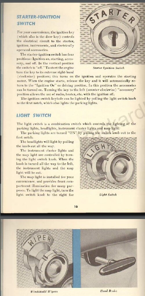 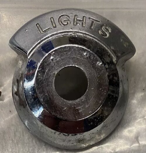 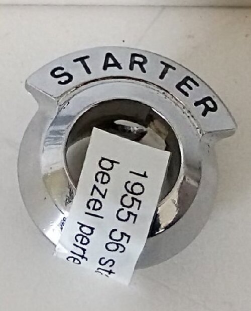
Posted on: 2024/6/18 22:19
|
|||
|
1955 400 | Registry | Project Blog
1955 Clipper Deluxe | Registry | Project Blog 1955 Clipper Super Panama | Registry Email (Parts/service inquiries only, please. Post all questions on the forum.) service@ultramatic.info |
||||
|
||||
|
Re: Fonts
|
||||
|---|---|---|---|---|
|
Forum Ambassador
|
Quote:
humanpotatohybrid wrote:......What's really odd is that the actual bezels have the same quirk where the starter bezel does not share the same font as the rest. (Most noticeably, the kerning is different HPH,  , I learned a new word today.......kerning! , I learned a new word today.......kerning!
Posted on: 2024/6/18 23:55
|
|||
|
Mal
/o[]o\ ====  Bowral, Southern Highlands of NSW, Australia "Out of chaos comes order" - Nietzsche. 1938 Eight Touring Sedan - SOLD 1941 One-Twenty Club Coupe - SOLD 1948 Super Eight Limo, chassis RHD - SOLD 1950 Eight Touring Sedan - SOLD What's this?  Put your Packard in the Packard Vehicle Registry! Here's how! Any questions - PM or email me at ozstatman@gmail.com |
||||
|
||||
|
Re: Fonts
|
||||
|---|---|---|---|---|
|
Home away from home
|
Kerning is a phrase in typesetting that refers the character spacing. It was something I remember first hearing in the late ‘70s when I was the editor of The Pious Pelican, PAC’s NorCal region newsletter. No computers then but I bought an electronic typewriter that could do it, along with adjusting the spacing between words, in order to justify the right side of the text.
Posted on: 2024/6/19 2:24
|
|||
|
All generalities are false.
Once I thought I was wrong but I was mistaken. Don Pierson Packard / IMPERIAL page CA DMV Licensed Vehicle VIN Verification 1951 Henney-Packard 3-Door Long Wheelbase Air Force Ambulance The 1951 Henney-Packard is For Sale! 1954 Packard Patrician 1954 Packard Patrician Parts Car 1956 Clipper Custom Sedan |
||||
|
||||
|
Re: Fonts
|
||||
|---|---|---|---|---|
|
Home away from home
|
Thanks for the info, I figured some of that. I did not know that about the brochure, I'll have to look at it again.
The factory drawings I'm sure would show the intent, but I have no desire to get a copy of those. Perhaps the starter bezels were made by the same company that made the starter switches, or one of their contractors. All the other ones were clearly made by the same company, whoever was doing that captive nut design (even though the wiper and liter bezels don't have it).
Posted on: 2024/6/19 12:41
|
|||
|
1955 400 | Registry | Project Blog
1955 Clipper Deluxe | Registry | Project Blog 1955 Clipper Super Panama | Registry Email (Parts/service inquiries only, please. Post all questions on the forum.) service@ultramatic.info |
||||
|
||||
|
Re: Fonts
|
||||
|---|---|---|---|---|
|
Home away from home
|
Typically brochures have a lot of airbrushing from earlier models or concepts. On my 1965 Imperial for example, the brochure shows huge LeBaron scripts on the c-pillar when in actuality they were tiny.
Posted on: 2024/6/19 12:56
|
|||
|
All generalities are false.
Once I thought I was wrong but I was mistaken. Don Pierson Packard / IMPERIAL page CA DMV Licensed Vehicle VIN Verification 1951 Henney-Packard 3-Door Long Wheelbase Air Force Ambulance The 1951 Henney-Packard is For Sale! 1954 Packard Patrician 1954 Packard Patrician Parts Car 1956 Clipper Custom Sedan |
||||
|
||||
|
Re: Fonts
|
||||
|---|---|---|---|---|
|
Home away from home
|
I found a good amount of differences in that brochure actually, that I did not notice before. Kind of a fun game.
Let me know if you see any more... packardinfo.com/xoops/html/downloads/1955_2GreatLinesBrochure.pdf 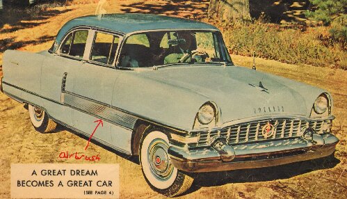 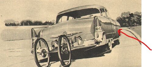 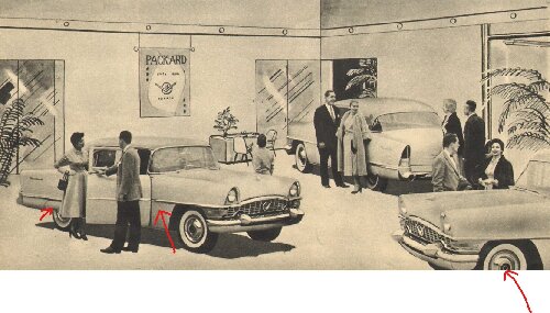 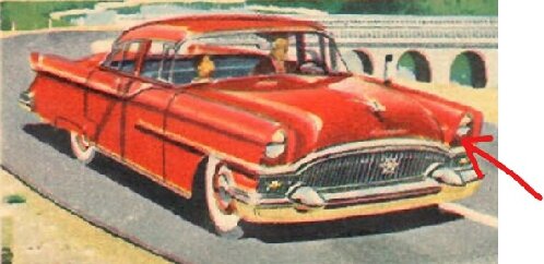 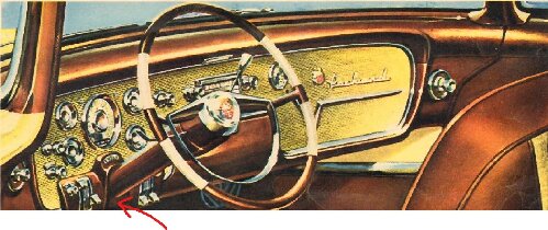 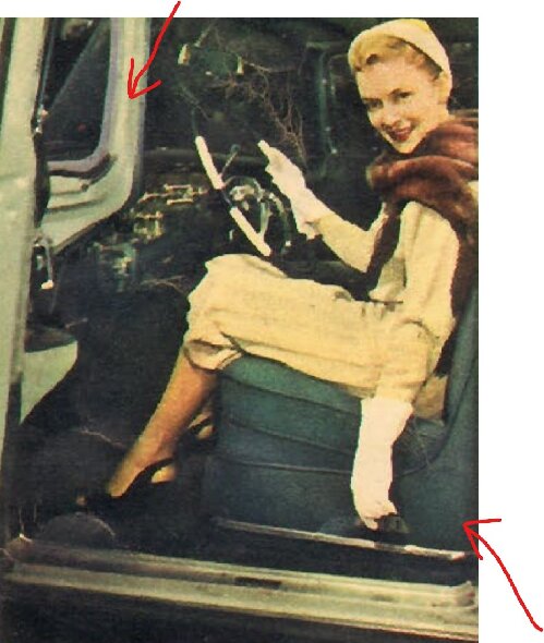 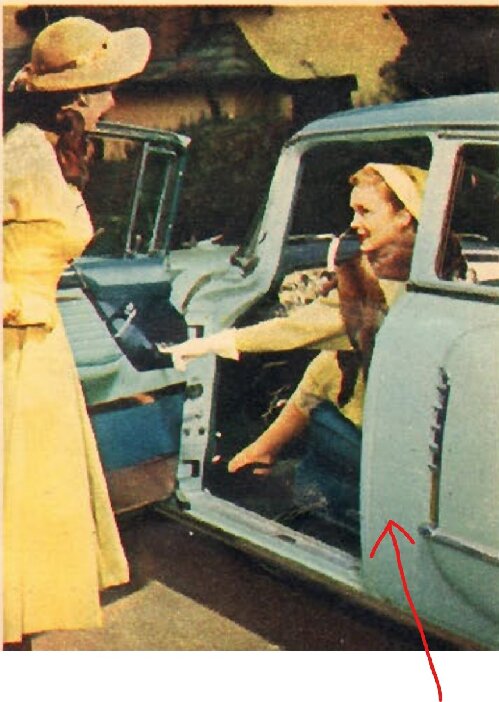
Posted on: 2024/6/19 17:20
|
|||
|
1955 400 | Registry | Project Blog
1955 Clipper Deluxe | Registry | Project Blog 1955 Clipper Super Panama | Registry Email (Parts/service inquiries only, please. Post all questions on the forum.) service@ultramatic.info |
||||
|
||||

